A titanic index finger presses down on a steely metropolis. This year’s Hiroshima Appeals poster, released July 11 by the Japan Graphic Designers Association (JAGDA), contains an earnest wish for peace in defiance of nuclear war. It was designed by Norio Nakamura, 55.

The horrifyingly massive digit, which serves as “a symbol of human weakness,” according to Nakamura, is a clear stand-in for the monstrous power of nuclear bombs — and the equally monstrous power of humans to control our own destiny with all the ease of pointing an index finger. The impact of the poster is heightened by Nakamura’s characteristically casual style in bright pastel tones. All in all, it is a worthy entry in an iconic series of posters that has contributed some of the greatest and most impactful images in Japanese graphic design.

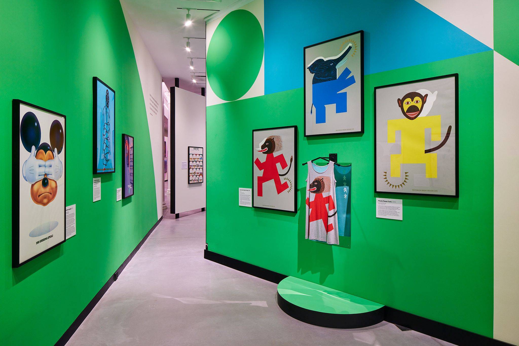
For the Hiroshima Appeals series, each year, a leading Japanese designer illustrates a personalized plea for peace in the spirit of Hiroshima, one of two Japanese cities that were destroyed by atomic bombs during World War II. Nakamura, selected as the 2023 designer, contributes to this collection with his distinctive, softly curving shapes and childlike spirit. The Kawasaki native follows in the footsteps of such design legends as Yusaku Kamekura and Kazumasa Nagai, as well as contemporary icons like Takuya Onuki.

“In the eyes of someone who is dying, what’s the point of a peace poster?” says Nobumitsu Oseko, secretary general of JAGDA. “Looking at a present reminiscent of a war like World War II, how do we even think about peace? In the midst of such danger, this year, I think Nakamura gives us one answer to such a question.”

Each year, a leading Japanese designer illustrates a personalized plea for peace for the Hiroshima Appeals poster series, which kicked off in 1983. This year’s designer, Norio Nakamura, chose to depict the monstrous power of humans to alter destiny with all the ease of pointing an index finger. |
Each year, a leading Japanese designer illustrates a personalized plea for peace for the Hiroshima Appeals poster series, which started in 1983. This year’s designer, Norio Nakamura, chose to depict the monstrous power of humans to alter destiny with all the ease of pointing an index finger. |

The most famous Hiroshima Appeals poster, Kamekura’s “Burning Butterflies,” kicked off the art project in 1983. The starkly beautiful colors of butterflies raining down from the sky like comets — or bombs, or suicide bombers — have grown into an iconic anti-nuclear image, and Kamekura’s work remains one of the most renowned posters ever created. Throughout the 1980s, the series quickly found its way into international exhibitions and, after a 14-year hiatus, resumed in 2005 to commemorate the 60th anniversary of the end of WWII. This year marks the series’ 27th entry.

Art historians and critics say that the magnitude and significance of the series is special. “The Hiroshima Appeals series creates a level of engagement — it bridges fine art and real world problems, and brings attention to an issue we’re still dealing with,” says Erin Schoneveld, professor of visual studies at Haverford College in Pennsylvania. “To have artists and designers respond to social crises for noncommercial purposes is unique.”

Eiko Ishioka and Charles White III’s 1990 poster of Mickey Mouse covering his eyes triggered a cease-and-desist order from the Walt Disney Company. Susumu Endo’s 2011 poster of vibrant red-and-yellow beams streaming down on Hiroshima’s famed Atomic Bomb Dome represented the damaged nuclear reactor that led to that year’s Fukushima disaster. And last year’s poster by Kashiwa Sato features big yellow circles in an aggressive “NO NUKES NO WAR” graphic — a pro-Ukraine callout in the aftermath of the Russian invasion.

The Hiroshima Appeals series’ legacy of bold creative decisions makes it a representation of the artistic freedom and avant garde nature long found among Japan’s leading graphic designers. “Japanese posters were extremely artistic in the 1980s and even the ’90s,” Oseko explains. “At the time, it was hard to imagine how some of these posters could even be used for commercial purposes, but those were the values of the era — the more artistic and experimental, the greater the cultural sophistication of the company, although the individuality of the design was also highly valued.

“Hiroshima Appeals continues this approach: The designs are about the feelings that each individual designer lives through — their ideas, feelings and vision.”

>Yusaku Kamekura’s 'Burning Butterflies' kicked off the Hiroshima Appeals project in 1983. The colorful butterflies raining down from the sky like comets — or bombs, or suicide bombers — have grown into an iconic anti-nuclear image, and Kamekura’s work remains one of the most renowned posters ever created. |
Yusaku Kamekura’s 'Burning Butterflies' kicked off the Hiroshima Appeals project in 1983. The colorful butterflies raining down from the sky like comets — or bombs, or suicide bombers — have grown into an iconic anti-nuclear image, and Kamekura’s work remains one of the most renowned posters ever created. |

Fluidity between high art and graphic design is a theme found throughout the history of Japanese design, says Schoneveld, who along with Nozomi Naoi recently curated Made in Japan, an exhibition of 73 historic Japanese posters at the Poster House museum in New York. The works from this exhibition make it easy to understand where Hiroshima Appeals’ tradition of daring artwork comes from. Ryuichi Yamashiro’s 1955 poster “Trees” consists entirely of various combinations of the kanji for tree, “木,” in a black typeface on a white background; psychedelic collage-style posters by experimentalist Tadanori Yokoo advertised Yukio Mishima, the Beatles and whiskey alike.

Nakamura’s contribution carries on another tradition besides innovative design: a legacy of peace art based in Hiroshima. Ever since the 1945 atomic bombings of Hiroshima and Nagasaki, countless Japanese artists, writers and creatives have centered their work around anti-nuclear and pro-peace themes. These works exist at every level of Japanese art — from masterpieces enshrined in their own museums like the haunting paintings of Iri and Toshi Maruki, “The Hiroshima Panels,” to the grassroots collectives of artists and poets in Hiroshima in the ’40s and ’50s, to peace art competitions for students held annually in Hiroshima today.

Regarding the contemporary urgency of the Hiroshima Appeals project, graphic designer Norio Nakamura says, 'We’re still very much connected to the day when nuclear bombs were dropped on Japan — and I made this year’s poster keeping all those connections in mind.' |

“Artists and writers did not only depict the atomic bombings and aftermath as past events but also used art to explore how those historical events are relevant to their present day,” explains Ann Sherif, professor of East Asian Studies at Oberlin College, who researches Hiroshima’s visual and print cultures. Hibakusha poets such as Yoko Ota and Sadako Kurihara protested nuclear proliferation during the Cold War; comic book artists Keiji Nakazawa and Fumiyo Kono depicted the horrors of the bombing in the manga “Barefoot Gen” and “In This Corner of the World.” Since 2004, the Hiroshima Peace Memorial Museum has sponsored the “Painting the Atomic Bombing with the Next Generation” program, which gathers survivors and students to meet face to face as the students go on to complete paintings over the course of nine months. The paintings are then exhibited at the museum every August and December.

Even as the history of the bombing grows further into the past, the poster series has managed to stay relevant. Takuya Onuki’s 2021 entry of a black-and-white bird in a snow globe is as visually provocative and appealing as any in the history of the series. The Japan Graphic Designers Association also plans to turn it into merchandise sold as souvenirs in Hiroshima as part of the organization’s efforts to expand the influence of the series with a younger generation.

Over a video chat interview, Nakamura says he is feeling the pressure of continuing the legacy of the series. The recipient of various Japanese and international design and illustration awards, he is the illustrator of critically acclaimed children’s books and has contributed designs to 21_21 Design Sight, Hermes Ginza, The Shiki Museum and The National Museum of Emerging Science and Innovation, just to name a few.

To stay focused, Nakamura says he concentrated on the contemporary urgency of the project. “Current events have made me realize that it is in fact possible for nuclear weapons to be used again. We’re still very much connected to the day when nuclear bombs were dropped on Japan — and I made this year’s poster keeping all those connections in mind.

“In my poster, I drew the now,” he says.